Solving TrainingPeaks’
Declining User Satisfaction Increased Churn
An upgraded experience for viewing and analyzing workouts in TrainingPeaks
Project Solving TrainingPeaks' declining user satisfaction score
Result Increased user satisfaction and workflow efficiency, allowing coach’s to scale their businesses. Increased coach retention and reduced support requests.
Summary I helped drastically increase user satisfaction by redesigning ‘workout cards’ to include rating of perceived exertion (RPE) and making workout cards quickly scannable. By eliminating the need to ask redundant questions, and allowing for an at a glance view of the athlete’s performance, TrainingPeaks’ coaches saved significant amounts of time.
*Solution was implemented on the TrainingPeaks web app and both iOS & Android mobile apps.
MY ROLE
Product Design Lead working with Product, Engineering, and R&D teams.
I led the UX and UI work, producing all design deliverables and presenting findings and designs to stakeholders throughout the process.

INTRODUCTION
What is TrainingPeaks?
TrainingPeaks offers comprehensive workout data analysis for coaches and athletes, combining scientific insights with subjective feedback.
What problem are we solving?
Coaches are not getting the information they need to efficiently coach their athletes. This is leading to a declining user satisfaction score and increased coach churn.
Solution
In addition to hard data, subjective measures like Rate of Perceived Exertion (RPE) provide valuable insights into how workouts feel to athletes. Integrating RPE allows coaches to optimize training, while athletes can track performance trends based on their RPE values over time. We could easily get this data from the athlete and serve it to the coach with no need for extra communication - making a more efficient and effective experience on both the coach and athlete side.
COACH USER FLOW
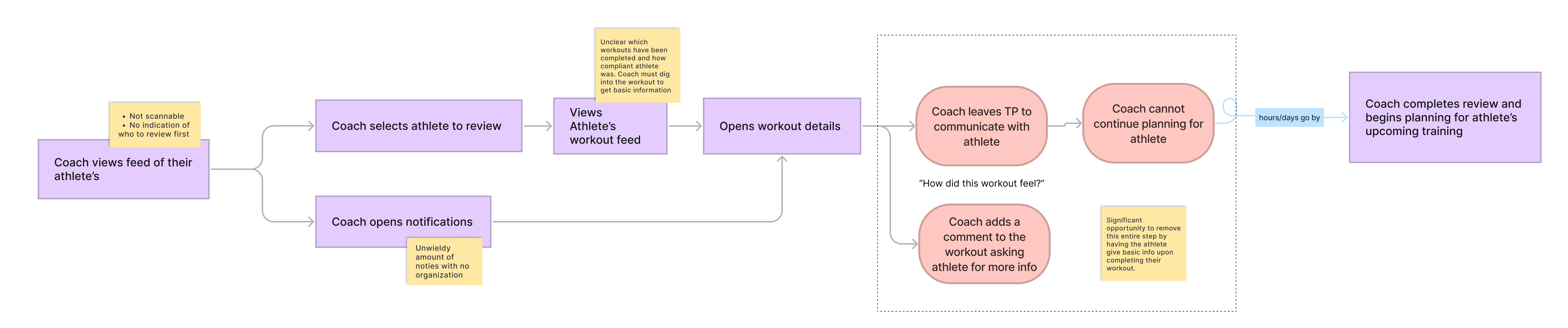
After chatting with a handful of coaches, the pain points became abundantly clear. I was able to map clear opportunities in their process that would significantly reduce the amount of back and forth communication with athletes that was taking up so much of their time. Additionally, it became clear that workout cards in the feed were hard to scan through; they lacked the information coach’s needed to quickly determine if the workout needed more attention.
OPPORTUNITIES
💡 Add ability for athletes to provide a simple RPE metric upon completing workouts
💡 Increase efficiency
Include workout title in the card
Give breathing room and space in the cards
Make the cards consistent and scannable
💡 Scalability - Give space for future additions to the cards
PAIN POINTS
❌ No indication of whether the athlete did too much or too little
❌ Reviewing workouts requires timely communication back and forth with the athlete
❌ Redundant task of asking athlete’s “How did it go?” after every workout
❌ Workouts are all titled with the workout type instead of the workout title, so there is no context for what the athlete was supposed to do
UNDERSTANDING THE VALUE

Beyond being a time saver (which is huge!), I also wanted to understand the value of bringing subjective feedback into the experience of logging a completed workout. I wanted to be sure this was something that would effect our business goal of increasing retention. I dug into our User Voice platform which has loads of requests from our users on the need for a way to track subjective workout data in the app. I reviewed all requests related to workout compliance, workout data, and subjective feedback and looked at our competitive landscape. RPE is not only industry standard, coaches said that this information is imperative to their ability to appropriately coach their athletes.
VALUE AND OPPORTUNITY
Target Audience
For the workout cards we focused on uncoached athletes who would need a bit more hand holding to understand training metrics.
We focused on coaches as the target user for RPE, with uncoached athletes as the secondary focus.
CARD DESIGN
In the design phase, I took what the team had learned, and started sketching ideas and wireframing. I knew we needed to clean up the cards and dedicate space for subjective feedback and saw a huge opportunity for letting the value of TrainingPeaks really shine with an improved interface and user experience.
TESTING
Using 3 of the strongest designs (as determined by key stakeholders), I created clickable prototypes. I ran 2 rounds of moderated, in person interviews, totaling 15 participants. From the tests I was able to refine hierarchy to improve usability, create an interface that could be scanned quickly, and give each key data point a home on the card.
WORKOUT CARD REVIEW
😮💨 organization goes a long way

EVENT CARD REVIEW
___________________________________________THE ‘RPE’ USER EXPERIENCE
Using the research we gathered early on, I jumped into UX flows and sketching.
I used ‘see/do’ diagrams to help illustrate the experience for an athlete inputting RPE after a workout. This helped give clarity when collaborating with team members before we did any wireframing or UI design work.
LOW FIDELITY TESTING
Lo-Fi prototypes used for early testing

Even though RPE is an action taken by athletes after they complete a workout, I found that coaches gain the most value from this information. This made testing tricky as we were testing 2 different experiences for the same feature - the athlete providing the feedback and the coach ingesting that data.
I started with wireframes in Balsamiq and got them in front of as many coaches and athletes as I could, as quickly as possible, to keep momentum and make small, impactful tweaks from test to test.
We saw that for usability, we needed to test with athletes, but for the information presented, we needed to be testing with coaches.
With input from athletes and coaches, I designed an experience that was intuitive for athletes, and extremely useful for coaches.
HIGH FIDELITY TESTING
⚠️ Unexpected hold up
After a few rounds of tests, we were unable to gain a clear answer to one part of the experience - there was no decisive result on where commenting should live with in the RPE experience.
We decided to move to high fidelity prototypes with 3 concepts for commenting flow variations. We ran one more round of moderated usability tests with the high fidelity prototypes, which yielded similar uncertainty.
Design and product ultimately made a final decision based on UX best practices, dev effort, and scope.
WAS IT SUCCESSFUL?

We released the updated workout cards first, without RPE, and had some backlash from our power users who were used to the old layout - this is very typical when we make significant changes, as we have users that have been with us for over 20 years. We monitored feedback and usage very closely and once the “shock” wore off, people were very pleased with the new look and layout. On the flip side, we also heard tons of great feedback from users who loved the new cards.
We heard feedback via social channels, customer success, and a follow up survey to users that the new cards are much easier to read. In a later iteration of the cards, we made the commenting, peaks, and RPE icons tappable, which has shown to be hugely valuable for efficiency.
RPE was praised from the moment it was released. Coaches and athletes love “the smileys” and we have heard from many coaches how much this feature helps them coach their athletes.
As far as success metrics go, both the cards and RPE were deemed a success based on increased coach retention and overall satisfaction. One of the best pieces of feedback? This article from a coach praising the importance of RPE on TrainingPeaks.