New navigation - Athlete Home
A complete redesign of the TrainingPeaks mobile app navigation
TrainingPeaks is an app that provides athletes with training tools that keep them on track to reaching their athletic goals.
This case study is the story of how we transformed the TrainingPeaks mobile navigation to engage and retain athletes.
MY ROLE & KEY RESPONSIBILITIES
• Lead UX Designer
• Conducted all research
Research plans, session guides, analysis, stakeholder readouts
• Designed all UX and UI deliverables
Wireframes, IA, Low and High fidelity prototypes
I worked alongside product management, engineering, data, and QA over the course of this 4 month project. This work was implemented on TrainingPeaks’ iOS and Android mobile apps.
The Old Landing Experience - Athletes were dropped into a chaotic calendar with no clear action to take
PROBLEM
While mobile downloads were on a steep incline, we saw a very high abandon rate from new athletes and low retention rate from existing athletes that were not using the app with a coach.
HOW MIGHT WE…
Show the value of TrainingPeaks’ powerful set of training tools?
Give the athlete an engaging experience from Day 1?
Empower and motivate athletes to reach their fitness goals?
Using qualitative data from surveys and interviews, quantitative usage data, and conducting workshops with stakeholders, I was able to deeply understand our users and their problems and start working with my team on possible solutions. Athletes were coming to TrainingPeaks hoping to use it to reach their athletic goals in the form of coaching or training plans, but what they found was a blank slate that left them confused. Alternatively, I found that athletes who came to TrainingPeaks from a coach referral had a much easier experience.
Hypothesis: A Home tab on mobile will guide athletes on their training journey and show them the value TrainingPeaks brings to helping them achieve their race goals.
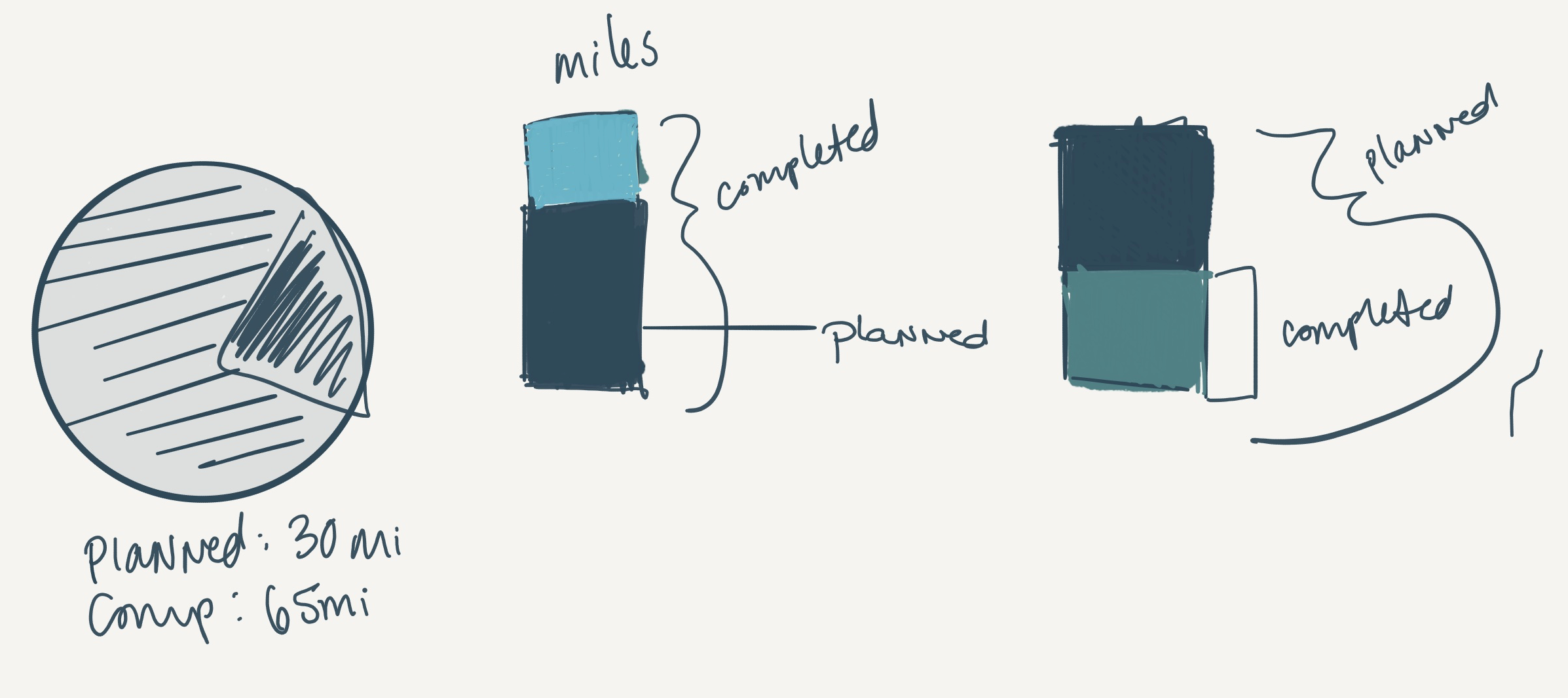
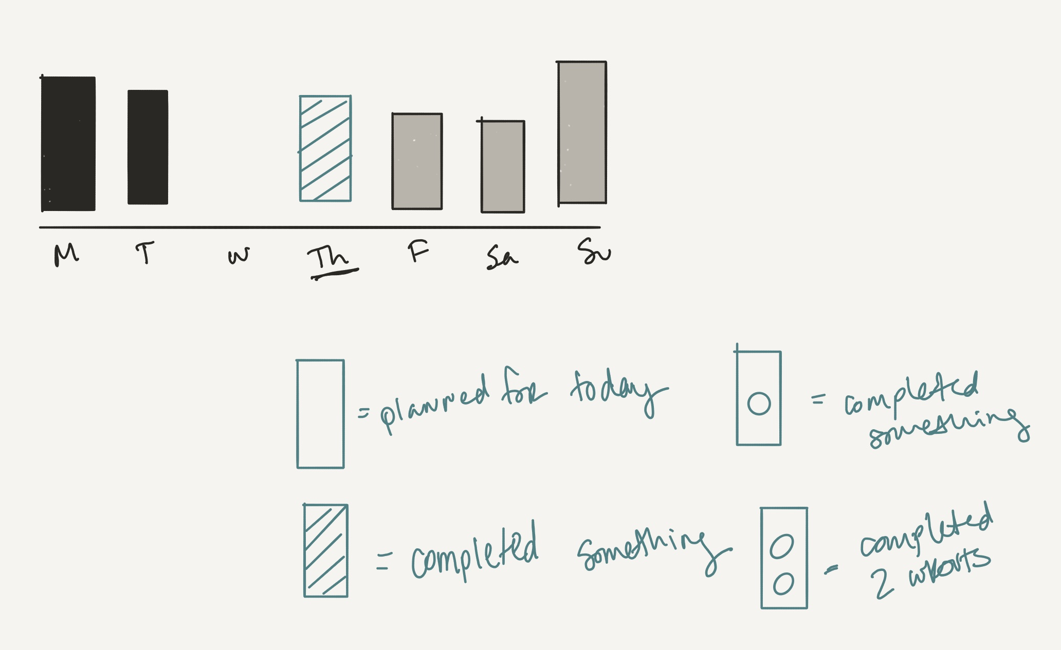
Initial Concept Sketches and Notes
VALUE AND OPPORTUNITY
We would focus first on the uncoached athlete who is new to TrainingPeaks. Based on our the research, this user type had the most to gain from an improved app experience and from a business perspective, we could make a strong impact on our retention and conversion numbers.
THE SOLUTION
My product manager and I decided we could answer our “How Might We” questions (see above) and deliver a viable solution to our abandonment problem by creating a new “Home” experience in the mobile app. In the Home tab, athletes would get an ‘at a glance’ view of their training and we would include some hand holding throughout their experience here. The Home experience manifested as a navigation overhaul - requiring the addition of a new tab to the main nav, aptly called, “Home.”
The home tab would become a space for athletes new to the product to get a view into the power of TrainingPeaks. They could find a training plan or coach here, plan their goals, and view their training progress. This new tab would provide a snapshot of their fitness journey; and serve as a place where they can feel proud of their accomplishments, stay motivated with an event countdown, review their week over week progress, and access or add today’s training.

Sketches to communicate early thinking and screen break down
DESIGN
The design phase started with user flows, drawings, and low fidelity wire frames to communicate the layout and basic information architecture.
I ran team brainstorms and design studios as a way of getting all of our ideas onto the table. From there, I would refine and create prototypes to test from the best ideas.
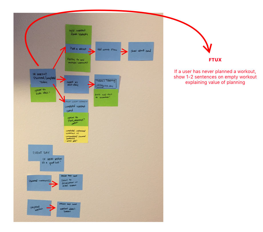
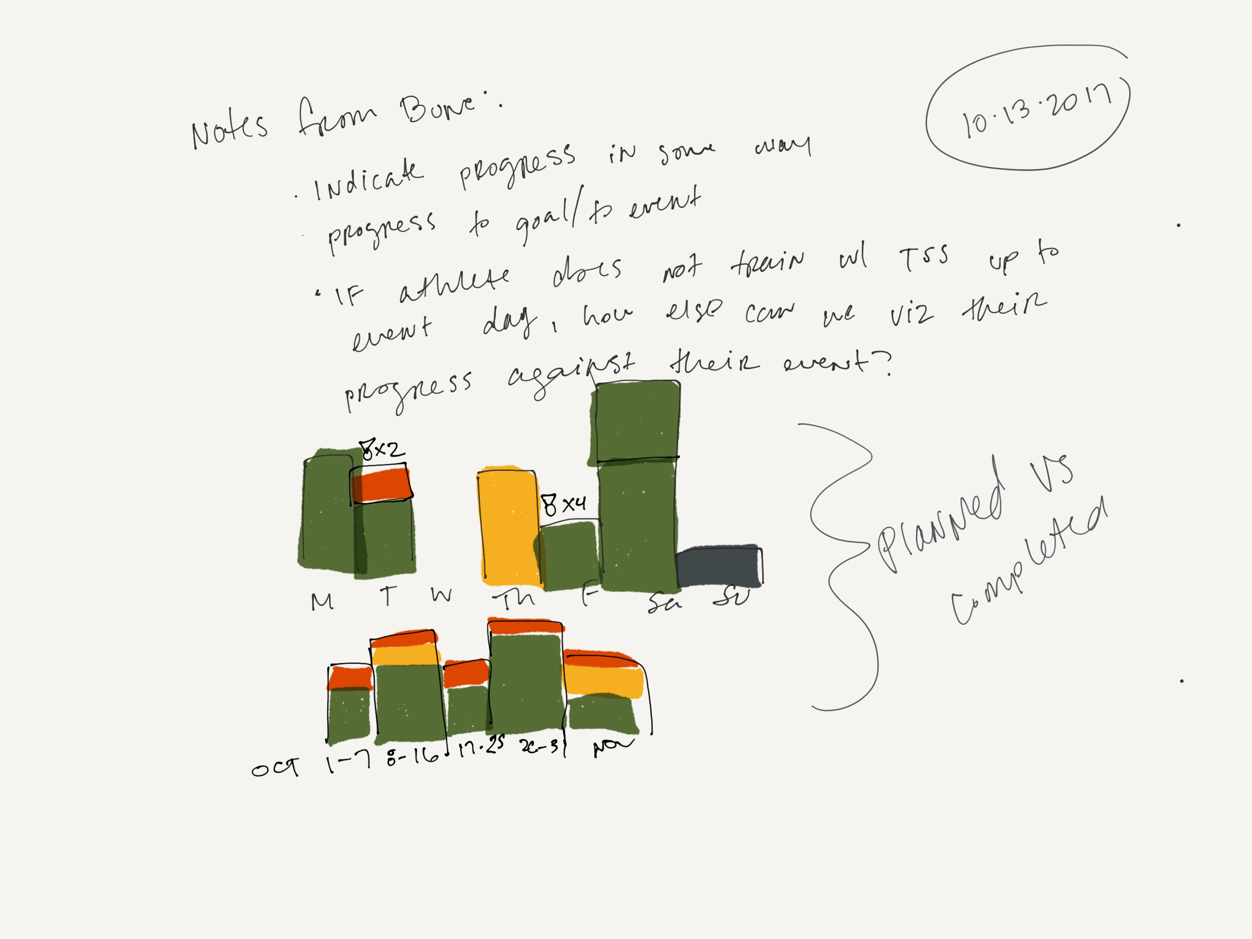
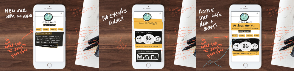
I broke the screen into 3 main sections to address each of the opportunities we gleaned from the research. Throughout each section we made sure to include context and tool tips to help the athlete understand what they are looking at and how it helps them.
About me (celebrate the athlete)
Race and workouts (Stay motivated, here’s what to do today)
Weekly Snapshot (Track your week over week progress)
Breaking up the screen in this way allowed us to test iteratively throughout the process and get feedback on each piece while moving forward on other pieces. This process also allowed us to collaborate more quickly with engineering.
TEST IT. MEASURE IT.
Throughout the design process I ran internal stakeholder reviews, sent out surveys, and conducted moderated, remote and in-person usability testing using InVision prototypes.
Testing regularly throughout the design phase gave us the ammo to simplify the UI down to the essentials. Our cycles of testing and refining improved the usability and value of the screen in a way that we never could have without user feedback. TrainingPeaks was new to this type of process and they quickly realized the value, as there is nothing more validating (or cringe-worthy...) than watching users interact with your product.
UI progressions
RELEASE PLAN
Internal Alpha
We were able to make some important improvements from this feedback before releasing to the public
Public beta
We saw a great deal of positive feedback in the beta and continued to make small, yet meaningful improvements
release!
It’s not over when you releasE
Notable Updates made post release:
Workout(s) of the day
Future weeks in the weekly snapshot
Workouts can now be swiped (iOS) or long press (Android) to edit, comment, or delete
WAS IT SUCCESSFUL?

Athletes adding events dramatically increased with the launch of Athlete Home

We were seeing a steady decline in premium subscriptions, early results showed a reverse of this trend with the launch of Athlete Home

Early metrics showed a 26% increase in WoW premium subscription upgrades
Early results:
• People are adding a lot of events to their calendars. 37% of athletes that landed on home last weekend did not have an event on their calendar. This has led to a huge spike in event creation.
• Feedback has been positive. 91% of all feedback directly about Home (tweets, facebook comments, instagram comments, reviews, CS tickets) has been positive.
• Users want to learn more. Last weekend, we had almost 10,000 taps on the three info bubbles on Home. We are viewing this as a positive indication that users want to learn more about their data and what it means.
• Comparing the average of the 3 weeks before release and the 3 weeks after release there is a 25.9% increase in mobile subscriptions.
1 year after release:
• Overall Athlete Home has been hugely successful in creating an improved experience for athletes and the rise in subscriptions has remained steady.
“The ease of use this provided for our customers, in what is otherwise a difficult platform, is incalculable.”